Monday, December 22, 2014

6 Fonts I Found

This font is decorative because of the bottom and top lines that are excessive. It is also Sans serif because there is no serif. This was found on a book to represent a publishing company. This is appropriate because it also creates an image to go with the book company.


This font is Decorative on the "D" and also Slab serif because it has a block like shape at the ends of the letter. This was found on a magnetic letter opener and is used to spread the publicity of the company. This is appropriate because it also incorporates their logo which is the lion making it very memorable.


This style is Sans serif because it has no base. This was found on my AP calculus textbook and is used to label the book. This doesn't do a very good job because it makes the book look super boring and makes math seem less fun just by the cover.


This style is Old style. I couldnt find one in real life so I found one online. This is from Google. I guess its purpose is to seem old. This is probably used on official documents and maybe some textbooks.


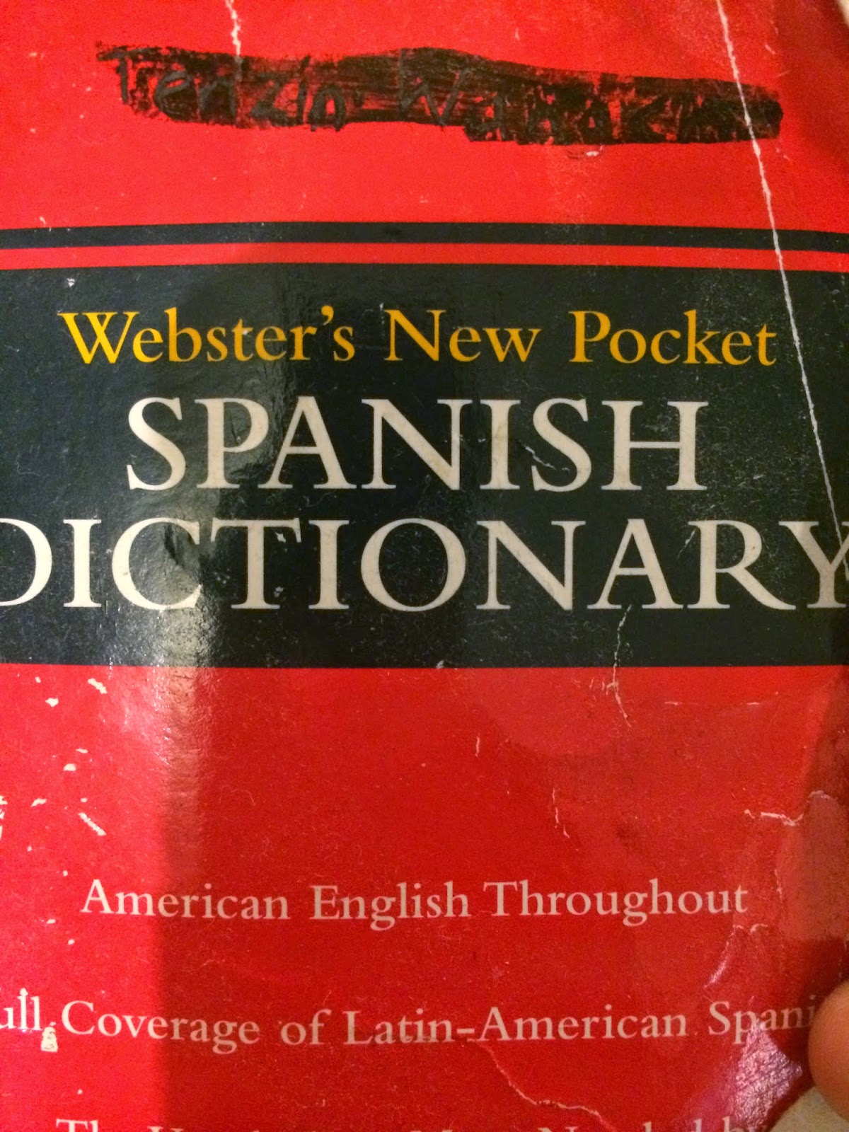
This Font is Modern because it is symmetrical vertically. This is found on a Spanish pocket dictionary. The purpose is to label the dictionary. The use of this font for this dictionary makes it very easy to read. This is used appropriately and not too much for the viewers eye.


This Font is San Serif. It is also block like. This is found on a monopoly game and is used to show the name of the game clearly and uses the colors to help make it memorable. This was used well because the letters are also very large and easy to read from a distance.

Friday, December 19, 2014

Type of Font I Would Be

Action Man Extended Regular free font

Action Man Extended Regular | 221 Glyphs

I think this is my font because I like comics and this font is typically seen in old comics. Also this font has no serif and a little basic but has in proportionate lettering. For example, the thickness of the line is thicker in certain parts of the letter and thinner in other parts. Im a very simple person like this font and confusing like the in proportionate lettering. Also because this kind've font is called "action man" and im awesome.

Logo Design for MHS Club/Activity

Questions:
1) What do you do in film Club?
1) We make videos and film special events such as senior kickoff
2) WHat type of movies do you watch?
2)We don't watch moveis. We make our own films instead.
3)What do you talk about?
3) We talk about film idea and how to execute them as well on debate on camera angles and position to where the film should be shot. We also talk about scheduling so that the film would be organized.
4) Do you guys review movies?
4) No. We do not review movies we just make our own.
5) What else do you do in film club?
5) We also edit our own films.

Summary:
The film Club does not watch movies but in fact they create their own films. They also edit their own clips and discuss with each other about things such as lighting, camera angles, position and scheduling. Their films are usually of Millennium events.

Tuesday, December 16, 2014

Good Logos


This is the monster Logo. I think that this is a good example of a good logo because it looks like claw marks made by a monster which makes sense. It also uses very bright green colors which is very vibrant against a black monster can making it stand out and very recognizable. The simplicity also makes this logo so good because it can easily be recreated,
Shield by Deividas Bielskis
I think this logo is very well created because its use of only using 2 colors making it simple to recreate and doesn't overwhelm the viewer with a lot. This makes me think of identity protection because the thumb print makes me think of identity and the shield reminds me of protections and together gives me the idea that this is a symbol for an identity protection agency. I also think that using a small palette of colors is beneficial because it keeps the symbol simple and easy to remember. Using the bright blue also makes the symbol stand out very well.

Wednesday, December 10, 2014

Portrait Transformation Project

      Before Photoshop:                                                               After Photoshop:
   
This is my transformation project. I transformed Kelvin into some cloudy backgrounds to give a theme of relaxing and some abstraction just for fun. My concept for this was relaxation and I did this by putting him in clouds because they're relaxing and calming. I also decided to copy his face in the background and make them faded.