This font is Decorative on the "D" and also Slab serif because it has a block like shape at the ends of the letter. This was found on a magnetic letter opener and is used to spread the publicity of the company. This is appropriate because it also incorporates their logo which is the lion making it very memorable.

This style is Sans serif because it has no base. This was found on my AP calculus textbook and is used to label the book. This doesn't do a very good job because it makes the book look super boring and makes math seem less fun just by the cover.


This style is Old style. I couldnt find one in real life so I found one online. This is from Google. I guess its purpose is to seem old. This is probably used on official documents and maybe some textbooks.
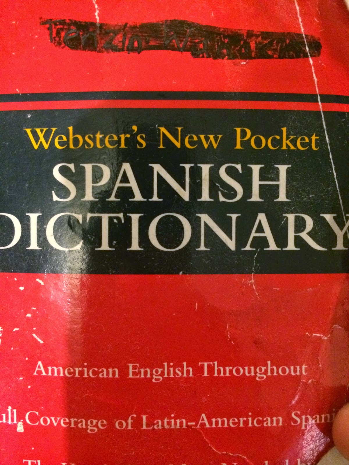
This Font is Modern because it is symmetrical vertically. This is found on a Spanish pocket dictionary. The purpose is to label the dictionary. The use of this font for this dictionary makes it very easy to read. This is used appropriately and not too much for the viewers eye.
This Font is San Serif. It is also block like. This is found on a monopoly game and is used to show the name of the game clearly and uses the colors to help make it memorable. This was used well because the letters are also very large and easy to read from a distance.


